• Murals & Paintings
  • Logotypes & Monograms
  • Lettering & Design
  • About
  • CONTACT
  • Blog
  • Store
    • Lake Effect
    • Mahalo
    • Flatbush Fest
    • Wiloha
    • Comcast / Xfinity Lettering
    • Stuffed Pierogi Truck
    • Coffee
    • Peabody's Advertisments - Lettering
    • Ready 366 Mural
Menu

Ray Mawst Lettering & Design

Ray Mawst Lettering & Design
  • Murals & Paintings
  • Logotypes & Monograms
  • Lettering & Design
  • About
  • CONTACT
  • Blog
  • Store
  • Case Studies
    • Lake Effect
    • Mahalo
    • Flatbush Fest
    • Wiloha
    • Comcast / Xfinity Lettering
    • Stuffed Pierogi Truck
    • Coffee
    • Peabody's Advertisments - Lettering
    • Ready 366 Mural

Illustrative Lettering Process

March 11, 2016

Hello! Spring is pretty much here! And in this weeks newsletter, I'll walk you through some of the process behind the creation of my latest spring inspired illustrative lettering piece. 


1. Decide on a word and concept / Research and collect a visual catalogue of your elements.
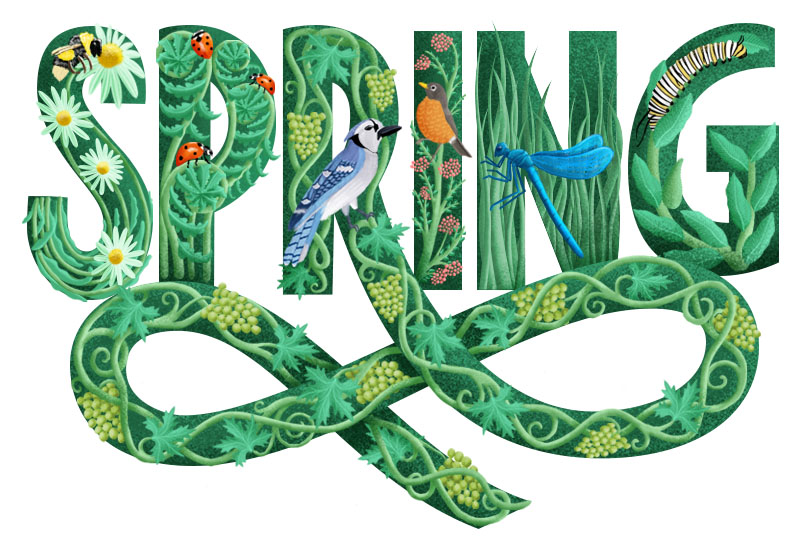
The weather here in Wisconsin has been beautiful lately, so choosing my word "Spring" and concept of wildlife and growth came really easily. When you have decided on a word and concept for your project, jot down a list of elements that could potentially make it into your project. For me, my list included things like: flowers, birds, plants, trees, buds, leaves, insects. After creating my list, I started to do some research online.

Now that we have a list of some of the things we want to incorporate into our design, we can start to do a little bit of visual research. One of my favorite online resources for image research is Pinterest. Honestly, I am not really into pinning images to boards. I save the images I like to my a folder in my documents, so I can later design my own board in Adobe Illustrator. 


2. Sketch a skeleton of your word
Now, it's time to develop the bare bones of the lettering composition. Start sketching small mono-line thumbnails to quickly explore a bunch of possible directions. I went through a few options, and worked with script, serif, and sans-serif letters. Now that you have explored some options, chose one to move forward with and begin to work at a larger scale.


3. Refine your chosen sketch

My first refinement at a large scale starts with me drawing a baseline and cap height. I then draw each letter from left to right, trying to pay attention to width consistencies. 

Once I had the lettering to a decent place, I decided to sketch in the ornamental extension of the leg of the "R".

Filling in your outlines will give you a better sense of the real weight of the letters. I used an old Tombow brush pen and dipped it in ink to quickly fill in the letters.


4. Start sketching within your letters - Continue Research

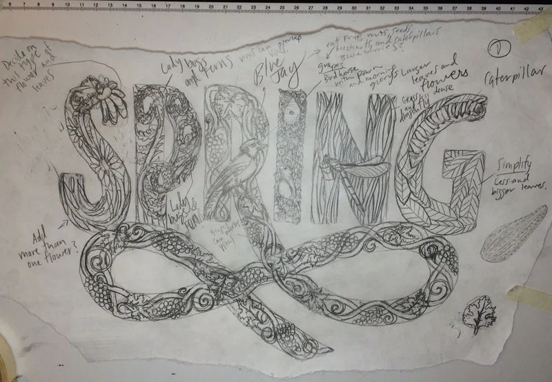
Once you have your lettering to a solid place, you can start drawing within each letter. Refer back to the board you designed in the beginning of the process, and consider how each element could be drawn to fit within each letter. I recommend choosing two elements from your board, and then doing further image research on each element. For instance, When I decided that I wanted to use the Blue Jay, I did some research on Blue Jays and found out that they eat fruit and have been known to eat grapes. So it really just takes a little bit of time to firstly, decide what you want to include, and secondly researching other elements to compliment. 

Here is a more refined pencil sketch.


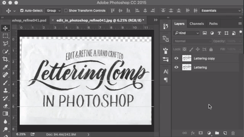
5. Go Digital - Scan you sketch, bring into photoshop!
Since we have already laid out the ground work for what we are trying to accomplish, we can approach working digitally with confidence. I recently invested in a Wacom Cintiq, and I highly recommend you invest in a digital tablet if you are looking to get into more digital work in photoshop.  Digital tablets are an incredibly powerful tool that speeds up workflow, and makes digital work a bit more hands on. It looks like Wacom has some pretty cheap models now days, so definitely look into it!

To add color, I used a combination of painting on layers with the paint brush tool (b), and drawing shape layers with the pen tool. Another thing is, you can bring in reference images into the document, and grab colors from the image to use in your illustrations. 


1 Comment

Edit and refine a hand crafted lettering comp in photoshop.

March 5, 2016

Hello! In this weeks newsletter, I want to share with you some tips and techniques for Editing and Refining hand crafted lettering compositions within Photoshop. For this demonstration, I have hand lettered a rough composition, executed it with a brush pen, and then scanned it to edit in photoshop. In this lesson, I will focus primarily on digital editing techniques within photoshop. So here we go! I'll walk you through some of the techniques that helped me get from the image below on the left, to the image on the right.


1. Scan in your piece of lettering
For this demonstration, I wanted to capture the natural texture of the lettering, so I began by scanning my lettering at a high resolution. (600 dpi) I recommend editing your lettering at a high resolution because you can always downsize your image if you want to post it to the web, but you cannot increase the resolution after you have scanned the image. Technically you can, but what happens is, photoshop will guess what the additional pixels should be, and it ultimately winds up making your photo look more blurry. 


2. Remove the background and retain natural texture
There are many ways to remove the background of your scanned lettering, but I have found the following technique to work the best for me. 

Use a levels adjustment layer to increase the contrast of a copy of your lettering layer.
I start by making a copy of my lettering layer (Hit Command + J on mac), and then add a Levels adjustment layer on top of the copy. By toggling the left and right sliders toward the center of the levels diagram, we tighten up the contrast between the dark lettering and the light background. This will improve the accuracy of the mask we are about to make, in order to cut out the original lettering from the background. Next, select both the levels adjustment layer and the Lettering Copy layer, and merge the two by hitting Command + E on mac. 

Use Color Range to make a selection
Now that we have a copy of our lettering that is reduced to solid black letters on a white background, we can use Select > Color Range from the top drop down menu of photoshop to select the black in our copy layer. After hitting OK, you will have created the selection around your lettering that is needed to remove the background. Next, delete your lettering copy layer, select the original layer by clicking on its name, and then mouse over and click on the Add Layer Mask icon at the bottom of the Layers palette. (It looks like a rectangle with a circle cut out of the middle) Now you have successfully separated the lettering from it’s background while retaining the natural texture of the original scan.

Use the Polygon lasso tool to quickly separate each part of your composition
Hit L on your keyboard to access the lasso tool. I prefer the Polygon Lasso tool because you don't need to have a steady hand to create a quick selection. If you hit L and photoshop defaults to regular lasso tool, you can hold shift while hitting L and it should cycle through to the Polygon lasso tool. You can separate each part of your composition onto its own layer by selecting it with the lasso tool, hitting copy, delete, and then paste in place by hitting Command + Shift + V. This will create a new layer for the object you have pasted. Name that layer and then move on to your other sections. In this case, I separated the top, middle, and bottom portions of the composition.

So this is where the fun begins!  Now that we have the lettering isolated from its background and each section on its own layer, we can more easily make adjustments. 


3. Align letters using geometrically sound guidelines
Since I sketched out the lettering by hand, the phrase “edit and refine a hand crafted” sits on a less than perfect arc. To create a geometrically sound arc for a guideline, we can use an ellipse from the shapes menu. 

Use an ellipse path to create guides for positioning your letter on an arc
Start by creating a new Layer and name it Arc Guide. Then select an ellipse from the shapes menu in the toolbar. You can hit shift + U to cycle through the shapes, or you can click and hold for a menu of shapes to pop up. Click on the ellipse, and make sure that it is set to create a path as opposed to a filled shape. Once you drag out the ellipse to whatever shape you are going for, select your path from the paths palette and click on the Stroke Path with brush Icon at the bottom of the Paths Palette. Now, you can add a colored stroke from the FX menu to your path and duplicate this layer to be used as guides for your arc.

Align your letters to the arc guide created from the ellipse path
Now with your arc guides created, you can use the Polygon Lasso tool to quickly select each letter to align it onto the guide. To adjust a letter that is too small, select the letter with the lasso tool, then hit Command + T to access the transform boundary box. From here, you can position the letter on the guide and and adjust the height or width by dragging the top, bottom, left, or rightedge. If you want to skew the letter, you can hold down Command and click on the top, bottom, left, or right corner.


4. Adjust the shape of a letter with the Warp Tool
This is a really powerful tool! In this demonstration, I wanted to elongate the descender of the letter “p”, but I didn’t want to affect the tail that loops off of the descender. 

Use Warp Tool to adjust curves
To do this, I selected the right portion of the descender, moved it down until it was positioned where I wanted it, and then used the warp tool to adjust the loop. After selecting the area we want to warp, we can hit Command + T again to open up the transform boundary box. Now, we can hit Control and then click, to prompt the option to select the Warp tool. Working with the Warp tool is really intuitive. You just click and hold on the area you want to move around, and then adjust from there. This tool is great for adjusting curves. 

Use the Clone Stamp Tool to patch up broken letters
The Clone Stamp Tool will allow us to compensate for the missing part of the descender between the new and old position. Hit S on the keyboard to bring up the tool. The way it works is, you sample an area by holding down the Option key and clicking, and then you can basically paint with the texture of the area you have sampled. For this example, I sampled the areas above and below the area that needed to be filled. I like to fill the interior of the letter using a soft brush, and a hard brush for the edges.

Adjusting brush size and hardness has never been so easy.
We can easily adjust the brush size and hardness by holding down Control + Option, clicking, and then dragging the mouse up, down, left, and right. Dragging the mouse left and right will adjust the size of the brush, and dragging up and down will adjust the hardness and softness of the brush. When you get a hang of this technique, it really speeds up your workflow!


Well, I hope you guys learned something from this article! And if you are hungry for more knowledge, a fellow lettering artist Dina Rodriguez under her business name Letter Shoppe, has put together a similar but different process for editing your lettering digitally! Her article talks about editing in photoshop, and then vectorizing in illustrator. Definitely check it out. I think it's really important to learn from as many people as you can. Doing so, you will build up a wealth of knowledge to tap into when solving lettering or design problems.


Comment

The Art of Observation - How to Improve your lettering

February 26, 2016

Hello! In this week's newsletter, I want to write about the power of observation. I will give you two solid tips about what to practice in order to improve your lettering skills, and an invaluable concept about how to practice. In the first few years of my higher education, I learned in my drawing classes that we should learn to draw what we see, and not what we know. By drawing what we see, we are using the art of observation to guide our hand in the creation of the marks on the page. Below are two ways we can use our observational skills to improve our lettering.


1. Study Calligraphy - We can acquire a better understanding of fundamental letter construction through the practice of calligraphy.
In order to create a successful piece of lettering, it is important to base our letter construction off of a pre-existing alphabet. We can style the letters how ever we choose, but we must first build a strong foundation by leaning on examples of effective letter construction that has already been developed over the history of the written word. I highly recommend you pick up a copy of the book The Art of Calligraphy: A practical guide to the skills and techniques, written by David Harris. Below is an example of a lowercase letter "a" from an Italic hand scanned from the book.

This book is an illustrated guide that demonstrates the history of the western Latin alphabet. It is an exceptional resource because not only does it provide us with a wide array of scripts, it provides us with stroke-by-stroke demonstrations of each letter construction. I think one of the best ways to wrap our heads around proper letter construction is by getting our hands dirty (with ink) and practicing the rhythm and motion of each letter. Also, by learning a few different calligraphic hands, we can dramatically improve our understanding of what constitutes a structurally sound letterform.

Even a relatively basic understanding of calligraphic tools and techniques can aid us in the direction of our lettering. By studying different calligraphic styles, and the tools that are used to create them, we will more easily be able to grasp why letters look the way they do. In his book entitled Script Lettering for Artists, lettering artist and author Tommy Thompson writes, “...the character of the pen has formed the character of the letter.”. The key takeaway here, is that the study of calligraphy will give us the knowledge we need to more confidently execute our ideas. In a sense, it will demystify why and how letters look the way they do.

Learning a new style of calligraphy will help you learn other styles. Once you start practicing a few different calligraphic hands, you will start to see more and more relationships between the basic construction of each letter. I have noticed that practicing Italics with a flat pen, has actually improved my understanding of script lettering using a pointed tip brush. Below I hope to demonstrate some similarities between an Italic flat pen and script brush pen style. 


2. Deliberately practice your drawing skills
During a lettering workshop I took at the Cooper Union in New York City, the instructor, Ken Barber said “If you improve your drawing skills, you will become a better designer”. This statement has stuck with me, and it is something I also find to be true. 

Another way to improve your lettering skills is to draw an entire alphabet from A to Z. For this exercise, I will refer your to a lettering practice worksheet put together by the very talented lettering artist and entrepreneur, Ian Barnard. He has put together this worksheet for us and is offering it as a freebie on his website. He also offers an array of great products that can help you design in photoshop and illustrator, so while you’re on his company site, make sure to check out everything he has to offer! Below is a snapshot of the first few letters of his worksheet. 

In this worksheet, Ian has outlined the steps we need to take in order to draw each letter. He recommends practicing with a fine tip sharpie marker.


3. The golden ticket: How to Practice
This is something that definitely shouldn’t be overlooked! Now that you have the above suggestions of what to practice, now you need to know how to practice. 

It’s important to take your time with each letter to make sure you are fully understanding its proper construction. The method that I use when learning a new style is basically trial and error, but there is an incredibly important part of the process that should be recognized. Instead of passively attempting to recreate a letter, realizing it’s wrong and then right away trying again, make sure to stop after your first attempt so you can analyze what you have done. When you stop and analyze, ask yourself: How does what I’ve drawn look in comparison to the letter I am referencing? The next vital question to ask yourself is: What can I do differently next time, in order to improve my interpretation of the letter? Once you have decided what needs to be done differently in order to progress, only then should you try to draw the letter again.

Notice that after drawing the first letter “A”, I analyzed what I had done, looked back at my reference, and realized that I drew the bottom most right serif too large. I then actually wrote a little note, calling out that the serif was drawn too large. In my next attempt, I paid closer attention to make sure I didn't overdue the serifs.

In the example of the letter “C”, my first attempt was a little too condensed. So, I called out a note that I wanted to make sure to draw the curve with a broader arc. Drawing the round curve is definitely a challenge, and I admit that it’s something I need to continue practicing!

1 Comment

How to create a Modular Sans-Serif Type Lock-up using a grid

February 19, 2016

Hello! In this week’s newsletter, I want to show you how to use a grid to create a custom modular sans-serif type lockup. This is a fun and pretty simple technique. We will start with pencil and paper, and end by refining our piece in Adobe Illustrator. In Illustrator, we can tighten up our sketch on a digital grid system, and warp it to add some visual interest!


1. Initial sketch - Define basic letter relationships
Loosely sketch your word to find interesting ways that the letters can interact with one another. Don't worry about refining your sketch too much in this phase. Again, the point of the initial sketch is to find interesting ways that the letters can interact. If you look at my sketches, you will notice I wasn't concerned with perfect letter spacing. To start, write out your word and start experimenting with potential arrangements. Some letter combinations might work better than others for this style, so if you are struggling with your word, try a different one. Tip: You can incorporate a mixture of lower and uppercase letters. It's fun to tuck letters into open spaces, and to extend ascenders and descenders. Just experiment a bit and have fun with it!

sketch_01.jpg

2. Refine Sketch - Break out the grid paper, and set constraints.
I know that setting constraints for a project might seem limiting at first glance, but you will be surprised with how creative you become once you have set some rules for yourself. This is the step where we begin to pay closer attention to the details. A tip to help you get started working on the grid is to set some constraints regarding the size and spacing you will use to create your letters. During the process of creating your letters on the grid, you might realize that your constraints need to be adjusted in order to be able to construct one of your letters. That's ok, it's just part of the process. Adjust your constraints and then move forward! For my example, I decided to assign equal spacing between each letter, and to use that same measurement for the width of the counter shapes within each letter.
 

One way to increase the legibility of your lettering is to create consistency throughout the letterforms.

For instance, in my example, I have aligned the bottom of the bowl of the letter "e" with the bottom of the bowl of the letter "R".
Now, refer back to you initial sketch, and start drawing on the grid. I start by sketching the outlines of my letters and make adjustments as I move from letter to letter. Draw on the lines of your grid paper. This will help you draw straight lines, and help you maintain equal space between your letters. At this point, your lines don't need to be drawn with a ruler, but try to draw them as straight as you can. Just eyeball it for now.


3. Refine Digitally
First thing I do in illustrator when working in this style is, I go up to the View menu at the top of the screen and select "Snap to Grid". Having this checked will ensure that our lines snap perfectly into place on the grid. This is a convenient setting for working in this style where we want perfect spacing.

To create my letters digitally, I use a combination of the pen tool (P) and the rectangle tool (M). Using these tools, we can refer back to our refined pencil sketch and translate it to our digital grid. It's not necessary to scan or photograph the sketch, since it was drawn on a grid system. So, just by looking at our sketch, we can easily understand how many units tall each letter should be and so on. 

If you check out the animated GIF above, notice that I am able to shift around the points to easily change the height of the letters while retaining equal spacing. We can thank the Snap to Grid setting for this.

One struggle you might encounter while making your letters is how to deal with diagonal lines. For subtle shifts in the angle of a rectangle, it is acceptable to use the Free Transform tool (E) in Illustrator. Like I said, this works fine for subtle changes, but when you need to transform your shape to a sharper angle, I recommend you turn off Snap to Grid and use the rotate tool (R) to position the shape into place. Tip: After clicking R for the rotate tool, hold option and click to set a point from which your rotation will pivot. If you skew a rectangle too harshly with free transform, the shape will become obviously thinner. The tricky part is, after rotating the rectangle to the desired angle, you might see that it overlaps the boundary of your letterform. In this case, you will need to zoom in to add and remove vector points to retain the integrity of your refined sketch. An example of this is when I created the diagonal line for the letter "n". Tip: Hit the keyboard shortcut Command + Y on your mac to view your design in Outline Mode. This will show you the bare bones of your paths, and allow you to align your shapes more accurately.


4. Add Style with the Warp Effect

Once your are happy with your digital lettering, you can use the Warp Effect to make your lettering even more dynamic. Before using the Warp Effect, you will need to select and group (Command + G) your lettering. If you don't group your letters together, the Warp Effect will be applied to each letter individually, as opposed to warping the overall composition of your lettering. Once you have grouped and selected your lettering with the arrow tool (V), navigate to the top drop down menus of illustrator and scroll over the Effect column. From here you can scroll over the word warp, and you will have an array of different styles to choose from. For now, select arc. This will prompt a box that will allow you to preview all of the different styles before you choose. The advantage of using Warp Effects, as opposed to skewing your lettering, is that Warp Effects are non-destructive. If you open your Appearance panel, you can shut off the Warp Effect, and your lettering will be back to its original state.


5. Add Depth by creating an inline shadow or highlight
Once you have chosen your favorite warp effect, you can add depth to your piece by adding an inline shadow or highlight. To do this, we will use the Offset Path function, and the Pathfinder Tool. Both of these tools are game changers! So, if you don't know about these, this will be a great tip!

Above is a snapshot of the Offset Path function. By setting the offset to a negative number, the path that creates your lettering will shrink by what ever number you choose. Ultimately, You will end up with thinner letters within your original letters. 

Next, lets change the color of the newly offset path to a darker color so we can see it in contrast to the original.

We will know need to duplicate our newly offset path, and use Pathfinder to create the inline. Select the new path, and copy (Command + C) and paste the copy directly in front with Paste in Place (Command + F). Now, hold shift, and drag the copy down and to the right a little bit. The further you drag down and to the right, the larger your inline will be. You can also use the arrow keys. Once you have done this, open the Pathfinder panel by scrolling up to the top menu and select Window > Pathfinder. 

Now, select both copies of the offset path, and hold Option while hitting the Minus Front button on pathfinder. 

After all those steps, you should end up with something looking like this!

1 Comment

How to use a calligraphic tool to speed up your lettering process.

February 13, 2016

Hello! In this week’s newsletter, I want to show you how we can use a calligraphic tool to improve our lettering and speed up the process. I'll walk you through step by step and show you how to create a piece of script lettering using a pencil and Pentel Color Brush pen.

The cool part about lettering is that it is an iterative process, so we don't have to worry about writing the word perfectly the first time, like you do in calligraphy. We are able to draw and redraw our letters as many times as we need, in order to get them exactly how we want them. So don't get intimidated, thinking that you need to be a master penman (or woman) to incorporate a calligraphic tool into your process. Using the tool will only help us create better letters, not to mention it will save us time. So, below is my process outlined in a few simple steps!
 

1. Decide on a path
Your lettering will be guided by the direction of the path you choose. The center of each letter should rest on the path and each letter will naturally rise above and fall below the path. You can exaggerate the scale of your letters to create visual interest, and the scale of a letter in relationship to another letter will ultimately create a rhythm. It's important to think about the scale of each letter relative to the other letters so you can purposefully design the rhythm of your word. There's no set in stone formula to do this, but it's nice to have an assortment of smaller and larger letters. Try to avoid having multiple large letters in a row, and then only one smaller letter. An arrangement like this might look off balance, or cause the viewer to question why that one letter was made smaller. Below, I have demonstrated a few common paths. The ovals represent letters, and are included to demonstrate how the ductus should run through the center of your letters and word.


2. Draw a ductus
The next step is to draw a ductus for your lettering. A ductus also known as a skeleton, is basically a blueprint for your word that includes the number of strokes that make up each letter, and the direction, scale and speed at which they are written. For our example, I have decided to letter the word, "ductus" on a straight path. Tip: It's important to draw your letters at a consistent slope. You can draw diagonal guidelines with a ruler to create a consistent angle to reference while drawing your letters.


3. Use brush pen to add weight
Next, It's time to add meat to the bones of your skeleton, and we will do this with a Pentel Color Brush. It's a good idea to work on a separate sheet of tracing paper placed on top of your ductus. This way, if your hand slips while using the pen, your ductus will remain clean of any ink.

Try to draw directly in the center of your ductus when applying the ink with your brush pen. On the right, you will see that the ink should be distributed evenly on both sides of the ductus.

4. Refine with pencil
Now we can go back over the inked drawing with pencil to refine it. Again, use another sheet of tracing paper in order to work non-destructively. Drawing on top of your inked ductus with a loose sheet of tracing paper will also allow you to make corrections to your spacing on the fly. For instance, if you wanted to add visual weight to the thin lines, you will have to compensate for the extra weight added to both sides of the ductus, by scooting over the next connecting letter. You can easily do this by drawing on the extra weight, shifting your paper, and then proceed to draw the next letter so the connecting stroke lines up smoothly.

This part of the process is fun because you can really customize the look and feel of the lettering.


5. Refine digitally
Something that I am not ashamed to admit is that we can use photoshop to further refine our lettering once we have it to good enough of a place through traditional techniques. To further refine this piece, I scanned it at a high resolution (600dpi), and then made some minor adjustments using the clone stamp tool in photoshop. In adobe CC, the clone stamp keyboard shortcut is S. While refining digitally, you can smooth out areas that were a little rough, add a little weight here, remove some weight their, and really start to refine your lettering on that next level of attention to detail.


Well, I hope that you got something out of this! This is my first time ever creating a newsletter, and I want to make each post interesting and worth while! If you have anything you would like for me to write about , I would love to hear about it! Please reach me through email at raymawst@gmail.com

Also, if there is anything you think I can improve about the way I set up this newsletter, don't hesitate to reach out and let me know. I want to know so I can make it better for you guys! Thanks for taking the time to read this all, and I hope you have an amazing, and happy Friday!


1 Comment
← Newer Posts Older Posts →

Latest Posts

Featured
Jun 23, 2017
Jun 23, 2017
Jun 23, 2017
Jun 23, 2017
Gold Leaf Techniques On Glass & How To Start
Jun 23, 2017
Jun 23, 2017
Feb 9, 2017
Bracketing
Feb 9, 2017
Feb 9, 2017
Dec 30, 2016
Condensed Lettering
Dec 30, 2016
Dec 30, 2016
Dec 30, 2016
Mixing & Matching Letter Styles
Dec 30, 2016
Dec 30, 2016
Dec 30, 2016
Dot Grid Method
Dec 30, 2016
Dec 30, 2016
Nov 4, 2016
Tips For Creating Spontaneous Lettering
Nov 4, 2016
Nov 4, 2016
Sep 19, 2016
Tips For Understanding Flourishing
Sep 19, 2016
Sep 19, 2016
Sep 15, 2016
8 Books: My favorite and Most Useful Books
Sep 15, 2016
Sep 15, 2016
Aug 19, 2016
How To: Latin Letters
Aug 19, 2016
Aug 19, 2016
Duality_Mural_vines_Lettering.jpg

Murals & Paintings

Hand Painted Work

BlueWater_BG_monogram.jpg

Logotypes

& Monograms

Client and Personal

Lettering_Compilation_053117.jpg

Lettering & Design

Client and Personal


CASE STUDIES:

Flatbush Fest
Wiloha
Stuffed Pierogi Truck
Ready 366 Mural
Lake Effect
Comcast / Xfinity Lettering
Coffee