
Wiloha - T-Shirt Design - Lake Effect Surf Shop
A Wisconsin Surfshop offering surfboards, skateboards, snowboards, and locally themed apparel.
Happy with their new custom lettered logo design, Jake and Alaina Bresette reached out to me to help with the design of the first t-shirt to kick off Lake Effect's locally themed apparel line. They came to me with a concept, and I helped translate that idea into something tangible.

Wiloha shirts are on the shelves!
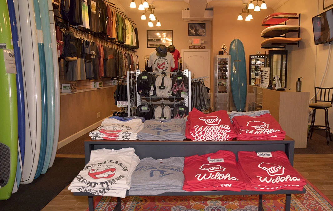
The Lake Effect Surf Shop is looking great!
Case Study
Below, I have put together a couple images to show you the behind the scenes work that went into the creation of the Wiloha T-shirt Design.
As you can see, there were many iterations, and each step was vital to the creation of the final design. Extra care was taken to simplify and maintain iconic legibility for both the hand and State outline.


To create the lettering for "Wiloha", I started by writing the word "Wiloha" with a thin and round paint marker. This allowed me to create lines with a consistent width. Once I had a refined sketch, I created a digital version within Adobe Illustrator.
The Optimized Vector is the final piece of lettering that accompanies the Wisconsin icon. In this version of the lettering, the capital letter "W" is simplified and it's strokes share a closer angle to the rest of the letters. Another subtle detail is, the connections between the letters have been thinned. If connections are not slimmed down, their will be extra weight where one letter connects to the other, and this can become distracting and a concern for legibility.

To create continuity between the the icon and the lettering, I designed the lines of both to be the same thickness.