
Gold Leaf Techniques On Glass & How To Start

Below, I use one of my most recent projects to demonstrate the process of Reverse Glass Gilding, and after the demo I provide a list with links to the materials you will need to get started.
REVERSE GLASS GILDING
Step 1 : Clean the Glass

Before getting to work, make sure the glass is free of finger prints / smudges and any lint or fuzz. Clean both sides of the glass with glass cleaner and a lint free paper towel.
Step 2 : Create your design

When you are just starting out learning the application of gold leaf, the design you create is second in importance to learning of the process. For your first project, I would recommend keeping the design as simple as you feel comfortable. Maybe just a primary shape, or a single letter. My first two gold leaf projects were a capital letter 'A' and a number '2'. Since this is my third gold leaf project, I decided to create a composition including a 'Lm' monogram paired with some custom Roman Capitals with Italic flare on the letter 'L'.
"Anything worth doing is worth doing poorly until you learn to do it well." -Steve Brown
I've included this quote as a little reminder for anyone just beginning to learn about this stuff. The only way we can get better and attain a stronger understanding of the gold leaf process is by just starting. Start simple and once the process makes more sense, then we can begin to create more intricate designs.
Step 3 : Create A Pounce Pattern to Transfer Design to Glass with Chalk

After sketching or printing your design onto paper, the pounce wheel is used to create little holes around the outlines of the design. After tracing the entire design with the pounce wheel on top of a cutting matt or piece of cardboard, rub the back of the paper with a fine grit sandpaper. This will open up the holes you created with the pounce wheel to allow chalk to transfer through the paper and on to the glass.
Step 4 : Prepare Water Size (water/gelatin based glue)
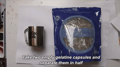

Water size is the "glue" that adheres gold leaf sheets to glass, and it needs to be prepared fresh before each application of gold.
Water Size Preparation: First, take apart the two halves of two capsules, and soak them in cold/room temp. distilled water for a couple minutes (just enough water to cover the capsules). The capsules won't dissolve into the cold water, but you will notice that they increase in size and get flimsy. Now, hold the stainless steal mug over top a medium flame about 1" away while constantly swirling the mixture. After a couple minutes, you will notice the capsules beginning to fully dissolve into the water. Cook the mixture until there are no visual remnants of the capsules. Then you can add more cold distilled water to the mixture to increase volume.
Step 5 : Apply Gold

Before laying down any gold. Tape your design to the back of the glass, and use it as a guide to know where to apply the gold. Notice, I have a white circle drawn. This circle was traced with a grease pencil, then the sketch was removed.
If you traced over the area with a grease pencil, make sure to flip the glass over so the grease pencil is on the opposite side from where you will be applying the gold.
Now, Take a Water Size Brush, dip it in the Water Size (glue) and flood the area of glass where you will be applying the gold.
Next, create a static charge by rubbing the Gilders Tip Brush on your hair, then open up your packet of gold to reveal a sheet and place the Gilders Tip Brush on top of the gold. The static charge should pick up the gold, and now the gold can be transfered from the gold packet to the glass.
When laying down multiple sheets of gold, it is desirable to overlap the sheets by maybe around a quarter inch.
Step 6 : Wait for Gold To Adhere, Then Rub Away Excess Gold

Sometimes it takes around an hour or more for the gold to entirely adhere to the glass . You'll know its ready when the gold become shiny. When the gold is shiny, take a cotton ball and lightly brush away any loose pieces of gold. Be aware that gold can scratch gold. So, when rubbing away the loose gold, make sure to clean off the gold that was picked up on the cotton ball before continuing removal.
Once you have removed the excess gold, you may find that you missed little spots. Now you can repeat the process, laying down extra gold in the places you missed the first time around. When the second gild has dried, clean away the extra gold again with a cotton ball. This time, you can add a little extra pressure with the cotton ball. Rubbing in a circular motion, you can smooth out any rough areas.
Step 7 : Transfer Design Using Pounce Pattern and Chalk
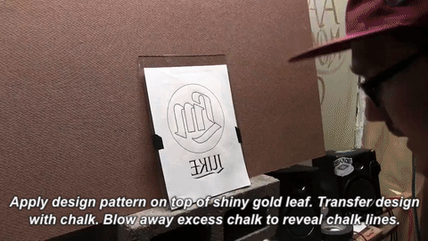
I am using a Quilt Pounce to apply the chalk, but if you're trying to save a bit of money, I've heard that you use also use a thick sock.
***I taped the pattern to the glass on the top, bottom, and sides. And when I was done chalking the pattern, instead of taking the whole thing off, I kept the pattern taped on the top. This way, I could fold and tape the pattern up and away from the glass, and fold it back down into the same position incase I needed to re-chalk the pattern. ***
Step 8 : Paint Backup Black Overtop Gold

Step 9 : Wash Away Excess Gold

Step 10 : Paint in the background a solid color

Step 10 : Let Background Paint Dry then Frame your Glass!

SUPPLIES
When I first started reading about gold leaf techniques, the entire process was foreign to me, as it might be to you. It took me a while to figure out everything that I would need to get started. So, I figured that sharing this knowledge in a list format would be helpful to people interested in learning about gold leaf! I've provided links for most the supplies, so if you are so inclined, you can build up your digital shopping cart.

Gold Leaf Techniques by Kent H. Smith - I highly recommend picking up a copy of this book and reading through the first few sections before getting started. The author explains gold leaf techniques in great detail. And this is how I learned the process. Below I have created a list of the stuff you'll need, and the book will help further explain how to use everything.

A Glass Picture Frame - Glass frames are relatively inexpensive, and most likely you already have some lying around in your basement, or hanging on your walls. I recommend starting with a medium size frame... maybe around 8"x10". Painting tiny details on glass can be difficult, so I recommend starting out with a very simple design. Maybe just one letter, number, or generic shape. The first couple times you try applying gold leaf to glass, its more about learning the process than the final outcome of the art created. So, keep it simple and be patient.

Genuine / Professional Quality Gold Leaf - It's an expensive way to learn, but I think it's important to use the real deal if you want to gain a better understanding of how genuine gold works. Imitation gold is a lot thicker, tarnishes quickly, and just doesn't act the same way as genuine gold, so why even bother?

Gilders Tip For Loose Gold- This Gilders Tip Brush is very thin, and is used to pick up and place the flimsy gold leaf sheets onto the glass. In order to pick up the gold leaf sheets, it helps to charge this brush with static electricity by rubbing the bristles on the hair of your head and/or arm.

Gelatin Capsules (Empty Pill Capsules) , Stainless Steal Mug, and Water Size Brush - Gelatin Capsules are dissolved into distilled water to create the Water Size AKA. "glue" that adheres the gold to the glass. Water Size Brush has thick hair and is able to hold a lot of Water Size, making it easy to flood your glass before adding the gold leaf.

Pounce Wheel, Chalk Quilt Pounce, & Cardboard/Soft Surface - The Pounce Wheel is used to perforate the outline of your design. Once you have holes in the printed paper version of your design, use it as a pattern/stencil. The quilt pounce is a little pouch filled with chalk, and when rubbed on top of your stencil, the chalk moves through the holes of your stencil, and in effect transfers your design onto the glass.

Backup Paint - After you've laid out all your gold and it's looking good on the glass, use Back Up Black to preserve the gold. Back Up Black is a black paint that dries hard and will protect the gold beneath where ever it is painted.

Brushes and Brush Maintenance - Lettering Quills - Mineral Spirits - Brush Preserving Oil -
Mack Lettering Quills are a nice brush to work with for sign painting. Since they have long hair, they hold a lot of paint and have a large range in terms of mark making capabilities. A single brush can create a hairline using the tip of the brush, and with a bit of pressure, can create a much thicker line.
Mineral spirits serve two purposes. They work to thin down paint that is too viscous, and also is used to clean the brushes after use. When you're done painting for the day and your brushes are clean, dip them in Brush Preserving Oil to keep them from drying out. If oil based paint dries in your brush, the brush will be ruined and the hairs will slowly start to fall out.

Bracketing

What is Bracketing?
Let's start with a definition and then let's look at a few examples.
A bracket is "the filled-in area that connects the serif to a stroke ..." -Doyald Young

In contrast, take a look at what modern fonts do. They remove the brackets so the end of each stroke meets a serif at an angle, creating a sharp and clean aesthetic.

Another example of where bracketing can be used is on the ball terminal of a letter. Check out these lowercase letter 'a's for instance. Another thing to keep in mind is that, brackets are not one size fits all. You can change the size of a bracket to create a smooth transition like the ball terminal of the 'a' in Didot. Or you could have a smaller and tighter bracket, as seen at the inside juncture of the ball terminal on the 'a' of Bodoni. Palatino is an example of no brackets for the ball terminal.

Why use bracketing?
Great question! A functional reason why you might choose to include a bracket on a letter is if you have thin strokes and serifs. Adding brackets to a thin stroke and its serif can add a little bit of visual weight, to help balance out the letter. Check out this example of the lowercase letter 'y' in the font Bauer Bodoni. The top left serif doesn't need brackets because it is attached to a thick stroke, but the thin stroke on the top right does have brackets.

Condensed Lettering
Lately I've been working a lot with lettering in a condensed style, so I figured I would share with you some thoughts on the style and tips for using it. If you haven't already heard, I'm currently putting together a new online lettering class with SkillShare, and I'll be teaching Interlocking Letterforms in a condensed style. So, I'll be going through some of this stuff in greater detail in my class. If you'd like to get an email notification when my class goes public in about a week or two, all you have to do is follow me on SkillShare.
Download My Condensed Font For Free . . . Yay!

Ok you guys. Let's be real. I am not a font designer by trade, and this font isn't meant to replace Helvetica Round. With that out of the way, I have developed this semi-complete font for use in lettering. This is actually the font I will be providing my Skillshare students with, in my upcoming class. Right now, I have completed the Uppercase, Lowercase, Numbers, and a few Punctuation Marks, but I think it serves it's purpose for the time being. Here's a dropbox link for you to download the font for freeeeee! :)
The font is not designed for copy text. (I would not want to read paragraphs set in this condensed alphabet.) My intention is that it be used as a springboard for lettering in a condensed style. So, in the following little demonstrations, I want to introduce you to the font and show you how I have been using it. This will give you a taste for some of the concepts I'll be demonstrating in mySkillShare class. These little snippets are actually taken from the content of my class, so you guys get an exclusive preview! :)
What the F**K is a Condensed Style?
Very good question, and thanks for bringing it up! Here's a dictionary definition:
"The letters of a condensed font have set-widths that are narrower than in the standard typeface from the same family. The term condensed font can also apply to fonts where each variation is much taller than it is wide."
And here's how I explain it. The dictionary definition is actually right on. For my condensed font, all of the letters share the same width, and are much taller than they are wide. They are all three units wide. The middle unit represents the counter aka. the negative space within a letter. So, the counter space is equal to the width of each stroke.

This Condensed Style Is Modular
Since the font style is tall with straight sides, it is really easy to manipulate. If you want the letters to be taller, you can just grab the top half of the letters and drag them up or down.

We can use this Font as a Springboard for our Lettering
The process I'll be teaching in my Skillshare class will cover how I manipulate this font into a more unique lettering composition. I'll be teaching how to sketch in this style, how to execute your sketch, and how to refine it within photoshop! The process will look something like this:

1. Initial Sketch

2. Typed Out Version - Using My Condensed Font

3. Manipulated Font - Rough Sketch

4. Manipulated Font - Refined Outline Sketch

5. Final Refined Sketch
Mixing & Matching Letter Styles

Try mixing Upper and Lowercase together (AKA Unicase)
One of my favorite illustrators, Steve Simpson, incorporates a lot of custom lettering into his work. Seen below, Steve uses a unicase style (Both upper and lowercase letters together). There is something about sneaking in lowercase letters in between the uppercase that just adds a bit of unexpected visual interest. He uses this style with "The Field" and "Dublin" below.

Try Adding Extra Weight Contrary To Normal Conventions
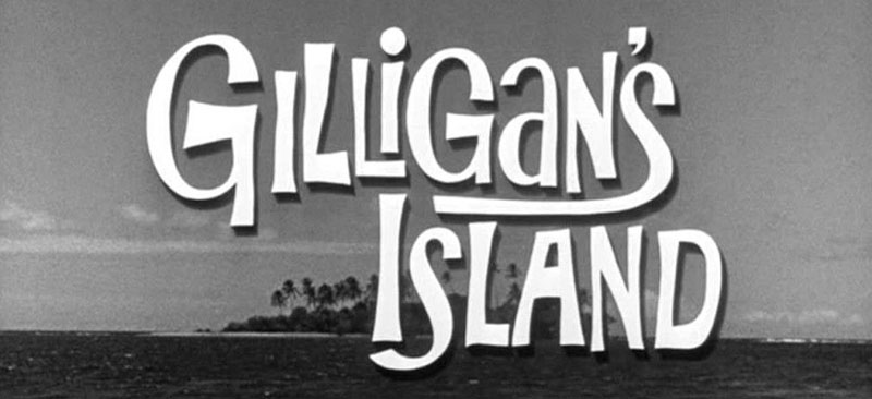
The Gilligan's Island TV show logo from the 1960's is also another great example of how a unicase style can be used in lettering. The letters are all over the place in terms of weight distribution, and they are drawn kind of wonky. But that is what gives the title some personality. Check out the way the lettering artist added extra weight to the cross bar of the capital letter 'A' in the word "Island". The same idea is applied to the first letter 'G' in the word "Gilligan's". This is a style I would like to personally explore soon.
Try mixing Roman and Script Forms (as well as unicase)
Doyald Young was a master lettering artist. In the example below (logotype by Doyald Young), the lettering has a consistent aesthetic, but he is actually mixing and matching styles. While most of the letters are based on roman forms, at the end of the word "Ridge", Doyald substitutes in a script letter 'e'. To make the incorporation of the script 'e' work in the composition, the rest of the letters are drawn with a bit of script flare to them. This lettering can also be considered unicase, because the 'y' is a lowercase, amidst all uppercase letters.

Try mixing Formal Script and Elements of Freehand Lettering
In this example of my latest lettering for the #GoodTypeTuesday Lettering challenge with the theme of your favorite art brand, I lettered the brand Wacom in an interesting mix of styles. While all of the letters are reverse contrast (thick on the top and bottom, and thin on the sides), each of the letters takes on a unique style. The 'W', 'a', and 'm' are drawn with both formal script elements (the flat top stems and branches coming off of the stems), as well as some brush script styling with the addition of swashes. The lowercase letter 'a' is drawn with an open bowl, which is often seen in brush script or quickly written words. The 'c' and 'o' are both formal script forms with reverse contrast.

Try mixing Roman & Script Forms in a Condensed Sans-Serif Style
Since we are on the topic of mixing styles, I thought it would be fitting to let you know that I am currently working on a new Skillshare Online Class! It's a step by step process that will teach you how to plan, execute, and refine your own custom lettering piece in an Interlocking Condensed style (like the interlocking lettering shown below)! This style is really fun, because we can use upper and lowercase letters, as well as script and roman forms. With so many different letterforms to work with, it is easy to can come up with some really interesting letter interactions!
At the moment, I am still working on putting together all the content for the class, but it's all starting to come together! If you haven't already, you can follow me on SkillShare. This way, you will get a notification when the class is published!
If you haven't signed up for SkillShare yet, you definitely should consider it! If you use my special link, you can get access to my first class "Illustrative Lettering: Turn Lettering Into Art", and all of the other classes on the website for $0.99 for the first three months! Honestly, It's an incredible deal, and you gain exclusive access to some of the best online courses on the internet!
