
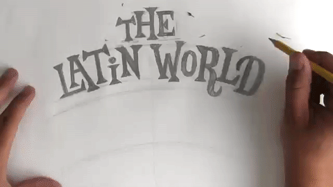
A while back, I picked up Ivan Castro’s book entitled, “The ABC of Custom Lettering: A Guide To Drawing Letters” where he shares his wealth of knowledge on the subject. I highly recommend picking up a copy! At the end of each section he prompts the reader to practice the style and offers an idea for a project. For this week’s newsletter, I’ll take you behind the scenes of what I lettered for the section project of his book on Latin Letterforms. The section project was to letter the title for a Latin Music Record Sleeve, and I chose "The Latin World Of Tito Puente".


Latin Letters - An Overview
I have always had an affinity for this style of lettering because it possesses such a strong personality. At the end of the day, Latin Letterforms are just serif letters, but the way in which the serifs are drawn separates the style from any other.
“The main characteristic of Latin is the use of triangular, wedge-shaped serifs.” -Ivan Castro
Like Ivan said, the serifs are drawn triangular and sharp, and the serifless terminals are also drawn with a sharp point. Below is an example drawn by Ivan pulled from the Latin section of his book, and I have called out the main characteristics of the style for you to see clearly. Also, Notice that the letters have a nice bouncing look to them.

Above: Latin Lettering drawn by Ivan Castro.
The Project - Custom Letter the Title for a Latin Music Record Sleeve
I started off with a bit of research and familiarized myself with "The King of Latin Music", Tito Puente. If his name isn’t familiar, his tune “Ran Kan Kan” will almost certainly be, as it is an iconic mambo song. To choose the title, I searched Spotify and found his album entitled “The Latin World of Tito Puente”, and decided it would be a nice challenge to develop a composition using these six words.
1. Figure out Hierarchy for the Importance of the Words

When I was picking out the album title to recreate, I looked for a title long enough to have some words that seemed more important than others. In the title "The Latin World of Tito Puente", the words can be categorized into three tiers of importance. The words “The” and "Of" are the least important, so I decided to draw them the smallest. I then decided that the words "Latin World" could be the middle ground of the hierarchy, and that the artist's name "Tito Puente" could be the largest in scale and at the top of the visual hierarchy.
2. Start Sketching Small- Loosely Figure Out Letter Relationships
To begin, I started to loosely sketch how the letters could interact. At this point, the sketch is drawn quickly, and serifs are roughly drawn to help realize where letters can bounce on the baseline and interact.
Since the serifs are pointed and stick out far from the basic structure of each letter, special care needs to be taken to solve for the letter spacing and positioning. By raising or lowering the letters in relation to the baseline, we can create room for the serifs to fit above or below its neighboring letters.
3. Refine Sketch - Redraw Composition at Larger Scale
Taking our small and loose sketch and re-drawing it at a larger scale allows us to essentially “zoom in” to the lettering to create more consistency. We can start to pay closer attention to how our serifs are drawn. Since I discovered a lot of the letter relationships in my initial loose sketch, this time around I am able to draw the letters more confidently.

4. Analyze Sketch - Define What Is Working, and What Could Improve
From analyzing my sketch, I came up with a list of changes that I wanted to address in my next revision. It pays off to stand back and take a good hard look at our lettering. Once we decide what to change, we can start to work through the details implementing the changes.

Here is a list of things to be refined:
* Align letters to consistent arcs and balance out composition
* Visual Hierarchy can be improved with scale. The word “The” in the composition can be a bit smaller, and the word “OF” could maybe get a bit larger, so the two words can meet in the middle at the smallest scale in the visual hierarchy.
* Refine the weight distribution - making sure each level of the hierarchy has it’s own obvious weight. The words “The” and “Of” should be the smallest, the words “Latin World” can be in the middle, and “Tito Puente” can be the largest and most bold.
* The composition can be better balanced and centered.
* Bouncing above and below the baseline can be less dramatic
* Does it work to use both a lowercase “i” and an uppercase “I”, or should they be consistent?
* Make "Tito Puente" bolder
* Reposition the word "Of"
5. Digitally Refine Sketch Within Photoshop - Align Sketch to Digital Grid
After scanning my sketch into Photoshop, I isolated the lettering from its white background, and created guidelines to help with positioning the letters onto the guideline arcs.

During this stage, you can start to manipulate the lettering in a few ways. Letters can be rotated and positioned onto the grid by making a selection with the lasso tool (L).

6. Recreate Sketch Digitally
To create consistency, I based all of the letters and serifs off of a single compound shape. I am showcasing the creation of this "W" to show you that we can create consistency in our letterforms, by copying and pasting exact shapes and then manipulating their positioning. The size of the serifs will then help dictate how we draw the letters.
