
Try mixing Upper and Lowercase together (AKA Unicase)
One of my favorite illustrators, Steve Simpson, incorporates a lot of custom lettering into his work. Seen below, Steve uses a unicase style (Both upper and lowercase letters together). There is something about sneaking in lowercase letters in between the uppercase that just adds a bit of unexpected visual interest. He uses this style with "The Field" and "Dublin" below.

Try Adding Extra Weight Contrary To Normal Conventions
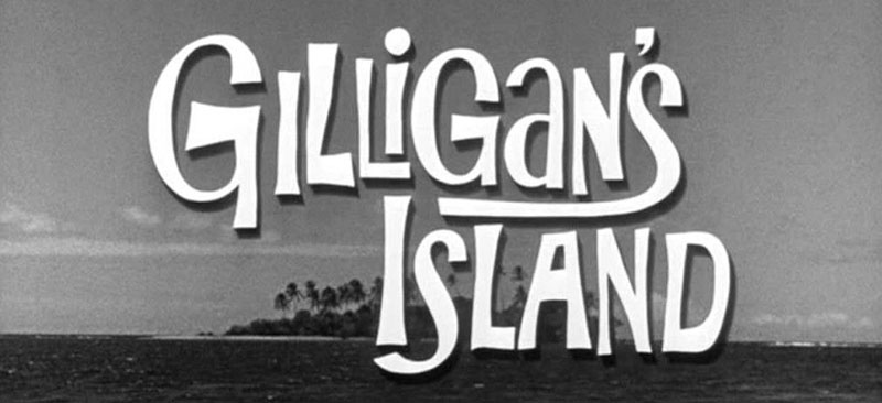
The Gilligan's Island TV show logo from the 1960's is also another great example of how a unicase style can be used in lettering. The letters are all over the place in terms of weight distribution, and they are drawn kind of wonky. But that is what gives the title some personality. Check out the way the lettering artist added extra weight to the cross bar of the capital letter 'A' in the word "Island". The same idea is applied to the first letter 'G' in the word "Gilligan's". This is a style I would like to personally explore soon.
Try mixing Roman and Script Forms (as well as unicase)
Doyald Young was a master lettering artist. In the example below (logotype by Doyald Young), the lettering has a consistent aesthetic, but he is actually mixing and matching styles. While most of the letters are based on roman forms, at the end of the word "Ridge", Doyald substitutes in a script letter 'e'. To make the incorporation of the script 'e' work in the composition, the rest of the letters are drawn with a bit of script flare to them. This lettering can also be considered unicase, because the 'y' is a lowercase, amidst all uppercase letters.

Try mixing Formal Script and Elements of Freehand Lettering
In this example of my latest lettering for the #GoodTypeTuesday Lettering challenge with the theme of your favorite art brand, I lettered the brand Wacom in an interesting mix of styles. While all of the letters are reverse contrast (thick on the top and bottom, and thin on the sides), each of the letters takes on a unique style. The 'W', 'a', and 'm' are drawn with both formal script elements (the flat top stems and branches coming off of the stems), as well as some brush script styling with the addition of swashes. The lowercase letter 'a' is drawn with an open bowl, which is often seen in brush script or quickly written words. The 'c' and 'o' are both formal script forms with reverse contrast.

Try mixing Roman & Script Forms in a Condensed Sans-Serif Style
Since we are on the topic of mixing styles, I thought it would be fitting to let you know that I am currently working on a new Skillshare Online Class! It's a step by step process that will teach you how to plan, execute, and refine your own custom lettering piece in an Interlocking Condensed style (like the interlocking lettering shown below)! This style is really fun, because we can use upper and lowercase letters, as well as script and roman forms. With so many different letterforms to work with, it is easy to can come up with some really interesting letter interactions!
At the moment, I am still working on putting together all the content for the class, but it's all starting to come together! If you haven't already, you can follow me on SkillShare. This way, you will get a notification when the class is published!
If you haven't signed up for SkillShare yet, you definitely should consider it! If you use my special link, you can get access to my first class "Illustrative Lettering: Turn Lettering Into Art", and all of the other classes on the website for $0.99 for the first three months! Honestly, It's an incredible deal, and you gain exclusive access to some of the best online courses on the internet!
