Lately I've been working a lot with lettering in a condensed style, so I figured I would share with you some thoughts on the style and tips for using it. If you haven't already heard, I'm currently putting together a new online lettering class with SkillShare, and I'll be teaching Interlocking Letterforms in a condensed style. So, I'll be going through some of this stuff in greater detail in my class. If you'd like to get an email notification when my class goes public in about a week or two, all you have to do is follow me on SkillShare.
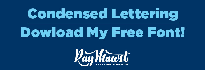
Download My Condensed Font For Free . . . Yay!

Ok you guys. Let's be real. I am not a font designer by trade, and this font isn't meant to replace Helvetica Round. With that out of the way, I have developed this semi-complete font for use in lettering. This is actually the font I will be providing my Skillshare students with, in my upcoming class. Right now, I have completed the Uppercase, Lowercase, Numbers, and a few Punctuation Marks, but I think it serves it's purpose for the time being. Here's a dropbox link for you to download the font for freeeeee! :)
The font is not designed for copy text. (I would not want to read paragraphs set in this condensed alphabet.) My intention is that it be used as a springboard for lettering in a condensed style. So, in the following little demonstrations, I want to introduce you to the font and show you how I have been using it. This will give you a taste for some of the concepts I'll be demonstrating in mySkillShare class. These little snippets are actually taken from the content of my class, so you guys get an exclusive preview! :)
What the F**K is a Condensed Style?
Very good question, and thanks for bringing it up! Here's a dictionary definition:
"The letters of a condensed font have set-widths that are narrower than in the standard typeface from the same family. The term condensed font can also apply to fonts where each variation is much taller than it is wide."
And here's how I explain it. The dictionary definition is actually right on. For my condensed font, all of the letters share the same width, and are much taller than they are wide. They are all three units wide. The middle unit represents the counter aka. the negative space within a letter. So, the counter space is equal to the width of each stroke.

This Condensed Style Is Modular
Since the font style is tall with straight sides, it is really easy to manipulate. If you want the letters to be taller, you can just grab the top half of the letters and drag them up or down.

We can use this Font as a Springboard for our Lettering
The process I'll be teaching in my Skillshare class will cover how I manipulate this font into a more unique lettering composition. I'll be teaching how to sketch in this style, how to execute your sketch, and how to refine it within photoshop! The process will look something like this:

1. Initial Sketch

2. Typed Out Version - Using My Condensed Font

3. Manipulated Font - Rough Sketch

4. Manipulated Font - Refined Outline Sketch

5. Final Refined Sketch