Do Not Neglect The Basics
Honestly, I say this all the time, but I can't reiterate enough how important it is to just practice the basics. Even when you think you have a pretty solid understanding, it's always good to step away from what you think you already know, and to take time to closely analyze what you are trying to learn. Before preparing for my workshop, I thought I had a solid understanding of brush script, but I realized that I had much to learn. And I am now proud to say that I have a much thorough understanding, but I am not too proud to admit that there is still much to learn. If you join me in a live workshop, I would love for us to learn together and to share my learning process.

Dot Grid / Graph Paper Method
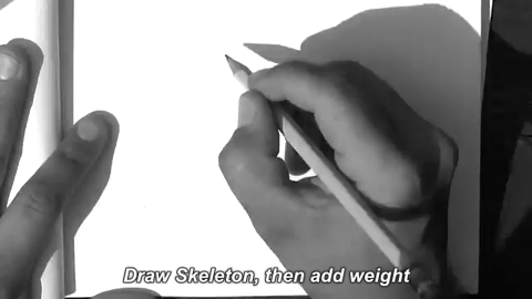
This is a method for helping determine consistent spacing and color in your lettering. The first thing you do is decide how tall and wide you want your letters. Then use the grid units to draw consistently spaced skeleton letters. (Dot grid hard to detect on this GIF because of image compression. But the arcs are over to the right two units and up 5 units)


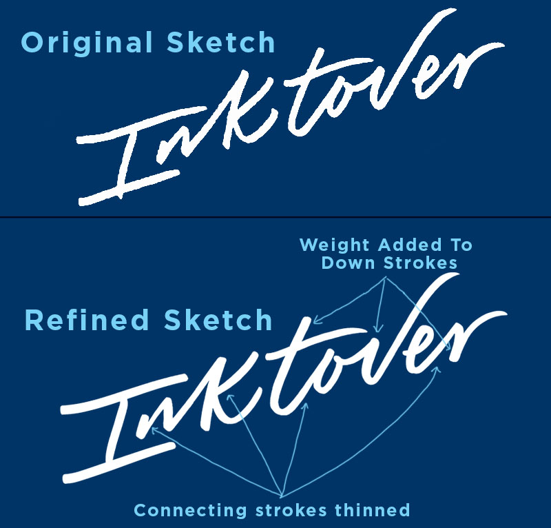
Next, use a brush pen to quickly add weight to the letters. Keep the upstrokes thin, and the downstrokes thick.

And finally, we draw over the second step to refine the letters even further.
So, This was only three step process, and you can already see how we can start to refine the letterforms using this method. This method helps us create a solid foundation to build off of. To move forward with this piece past this third step, we could increase the over all weight of the downstrokes, consider the contrast between the thicks and thins, and we could also break some of the connections between letters.