
Happy Friday! This week I want to share with you some tips for creating lettering that evokes the quickness of handwriting. It’ll be short and sweet, but I’ll be covering some important ideas. And I want to start off with this quote from the great lettering artist Doyald Young. In his book entitled Logotypes & Letterforms, he writes the following:
“In order for the script to appear spontaneous, the letters must change size, and there must be subtle variations in the spacing, or it will look monotonous and mechanical.”
Ideas To Keep In Mind While Sketching
Before I explain and demonstrate a couple methods that we can use to create spontaneous looking lettering, I want to share some ideas to keep in mind, so you know what design decisions can help steer your lettering in the spontaneous direction.

Lettering Credit for "Cascade" : Doyald Young
If we study this lettering example above, we will notice a few design decisions that help create the look of this being written quickly. First of all, the size of the letters vary greatly. Look at the difference between the first letter "a" and the letter "c". The "c" is drawn much larger than the "a", and this design decision lends itself to the imperfectness of handwriting.
Secondly, (not in order of significance) the letters bounce up an down on both the top and bottom. This creates a casual and less mechanically constructed look. Another consideration is that loops can be used to indicate the flowing motion of not picking up the pen. This is seen in the ascender of the "d" and also in the connecting stroke between the "d" and "e".
Finally, the first and last letters can include elongated terminals, and the angles of letters can be slightly askew. Thank you Doyald Young, for this beautiful example!
Method 1: Sketch Quick and Small, Then Enlarge To Refine
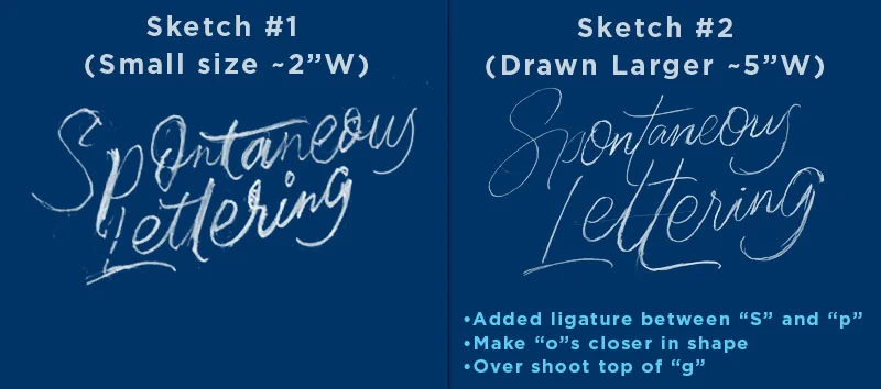
We can start by writing out the word quickly at a very small scale (around an inch depending on the length of the word or phrase). This method is all about rapid iterations and relies heavily on your handwriting to uncover your natural tendencies while writing quickly. It helps to write out the word a bunch of different times to see if you can have a “happy accident” where you create a natural ligature from the act of writing the word quickly.

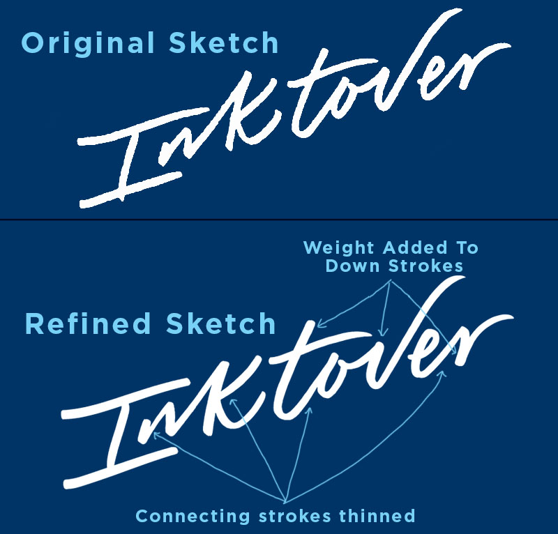
Above, I have circled the write out of the word "Inktover" I chose to refine, and below is a comparison of the original sketch and the refinements I made within photoshop. A couple things we can do to improve out little sketch, is adding weight to the downstrokes, and removing weight for the connecting upstrokes. This helps to create a more distinct separation between the letters; especially at the junction where the end of a connecting stroke and the downstroke of the next letter meet.
Method 2: Draw Skeleton, Add Weight w/ Marker, Add Movement Digitally
For this method, I started out by drawing a the skeleton of my letters at a small scale with pencil, and then redrew the skeleton sketch at a larger scale so I could easily make design decisions for refinement. After refining the skeleton sketch with pencil and paper, I added weight to the letters using a brush pen (Sketch #3), and then drew over the weighted sketch with pencil for next level refinement (Sketch # 4).

Before adding a couple of digital techniques, I wrote over Sketch #4 a final time with a Crayola marker to create a refined ink sketch (Sketch #5)

The two final steps I took in refining were done in photoshop using Kyles Brushes. His Mega Pack is only $15 and has so many incredible digital brushes! I highly recommend investing in them if you haven't already. They'll change your digital game!
Since I didn't actually use quickly written calligraphy to create this piece of lettering, I didn't achieve any texture within the letters. So, using a mask in photoshop and Kyle's brushes, I brushed away parts of the letters to create some faux movement. To do this, I followed the path for the stroke of each letter; adding and subtracting texture as needed.


The last detail I added was a loose gestural drawing around the lettering. I chose a thin brush, and drew lines extending from the terminals, and swooping around the curves of the letters. I thought that this added some visual interest and exaggerated the movement.


