
Hello everyone! Recently, I have been doing a bit of studying to learn more about typography, and for this week’s newsletter, I would like to share with you some tips for constructing serifs. There is an incredible wealth of knowledge on the history and construction of serif letters as a whole, so my explanation will in no way be exhaustive. Instead of giving a broad overview of all the characteristics of serif letters, I want to focus this article specifically on serifs to demonstrate how they have changed over the years.
Types of Serifs
According to Doyald Young in his book entitled Fonts & Logos, "There are four general kinds of serifs: horizontal, vertical, slanted, and triangular.". A capital Roman letter "E" has three of the four types of serifs, horizontal, vertical, and slanted.

Below is an example of a triangular serif on the top of the stem of a lowercase "i".

Humanist (AKA Venetian) - 15th Century
With the advent of the printing press in the mid-15th Century, printable type began to spread outside of Germany where it had originated. In 1470, Nicholas Jenson, a French type designer, moved to Italy where he introduced the art of printing. He created printable type inspired by the humanist style of handwritten calligraphy prevalent in Italy. So, his text typefaces were designed incorporate many calligraphic aesthetics. This style is known for its triangular, or wedge shaped serifs.
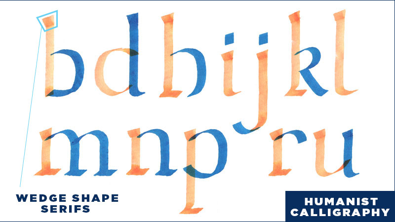

In the calligraphic version of the humanist style, wedge serifs are created by pushing the pen diagonally up and to the left and then up to the right utilizing the thin part of the flat pen. Then a straight vertical line is pulled down from the top of the serif.

You can begin by using a calligraphic tool and then lettering on top with tracing paper. When lettering in the humanist style, you can round out corners to refine the serifs and to give the letterforms a more friendly character.

If writing calligraphy isn’t your game, I recommend using grid paper while drawing. Lettering on top of grid paper is nice because you can use the units of measurement to more easily make sure the width of your letters is consistent. Unless you are working in a gothic style where letter spacing is consistent, letter spacing will differ depending on whether you have a straight letter next to a curved, or a curved next to another curved. So, lettering a word will inevitably result in letters beginning and ending in the middle of grid units. This is where we can use the units to guide our eye in determining a consistent width for our letters strokes. If you are going for a calligraphic style, you can draw light diagonal lines to help keep the angle consistent.
Old Style (AKA Garaldes)- 16th -17th Century
In his book entitled Fonts & Logos, Doyald Young says that "...font serif designs were similar up to the time of Bodoni's 1818 Tipographia Manuale.". In comparing Adobe Jenson (Humanist, based on text cut in 1470) to Garamond (Old Style, 1540), we can see that the serifs are similar, but definitely a bit different. Adobe Jenson has a wedge serif, which is more similar to Humanist calligraphy. Garamond on the other hand, has refined the wedge into a more acute triangular serif.

Transitional - 18th Century
Caslon (1725) and Baskerville (1772) are both models of the Transitional style. In this style, the brackets between the serifs and the stem are smaller than in the Old Style, and the serifs are a more refined rectangle. In this period of type history, the letters are starting to become more and more refined and less like replicas of the handwritten letterforms.

Moderns (AKA Didones) - Late 18th - 19th Century
Modern typefaces are exemplified by Bodoni. In this style, Contrast between thick and thin strokes is extreme, so the serifs are extra thin compared to other styles. Another thing to note is that the serifs are completely squared off and there are no curved brackets between the serif and stem. The Modern style has taken the leap from the Transitional style, which has some ties back to calligraphy, and has now taken on its own unique style separate from earlier aesthetic ties to humanist calligraphy.
