• Murals & Paintings
  • Logotypes & Monograms
  • Lettering & Design
  • About
  • CONTACT
  • Blog
  • Store
    • Lake Effect
    • Mahalo
    • Flatbush Fest
    • Wiloha
    • Comcast / Xfinity Lettering
    • Stuffed Pierogi Truck
    • Coffee
    • Peabody's Advertisments - Lettering
    • Ready 366 Mural
Menu

Ray Mawst Lettering & Design

Ray Mawst Lettering & Design
  • Murals & Paintings
  • Logotypes & Monograms
  • Lettering & Design
  • About
  • CONTACT
  • Blog
  • Store
  • Case Studies
    • Lake Effect
    • Mahalo
    • Flatbush Fest
    • Wiloha
    • Comcast / Xfinity Lettering
    • Stuffed Pierogi Truck
    • Coffee
    • Peabody's Advertisments - Lettering
    • Ready 366 Mural
header.jpg

Create a Custom Hand Crafted 3D Lettering Piece

February 5, 2016

Hello! In this week’s newsletter, I am taking you behind the scenes of how to create a hand crafted three dimensional lettering piece using found objects. I’ll give you some tips on crafting your lettering and composition with pen and paper, and walk you through the process of recreating the piece in the third dimension. This was actually my first time creating a three dimensional lettering piece, so this is definitely not the only way to go about it, just the way that I approached it.

coffee_design.jpg

To begin, I decided I would hand letter the word “Coffee” in a bold script and use coffee grounds and beans as the three dimensional medium. But before working with the coffee, I took my time to craft the lettering and composition.


1. Initial Sketches - Sketch small and find reference for the style you are going for.

These are just about an inch in scale. Working small will prevent you from getting bogged down in details that you shouldn't be thinking about yet. The purpose is to try different approaches to your style.

I didn't spend an exhaustive amount of time experimenting with different styles, because I knew that I wanted to keep the lettering pretty simple and execute it as a bold script. At this early stage in the process, it is important to just have fun with your sketches, but I do recommend finding a reference image for the style you are trying to achieve. Having a clear idea of what you are trying to do will shine light on the ambiguity of the creative process.


2. Refined Sketches - Start sketching larger to hone in on the details.

The next step is refining a couple of your initial sketches at a larger scale. Don't work too big, because it will only become harder to handle the letters and proportions. The scale at which you work might be best determined by the size of the tool you are using, but generally, you might now be sketching at around 4" - 12" depending on the length of your word. You can also limit your canvas size to 8.5" x 11".

Working at a larger scale will allow you to pay closer attention to the weight of your letters (how thick they are), the spacing between them, and the ways the letters interact with one another. For this project, I wrote the word "Coffee" with a Pentel Color Brush to lay down ink and to determine the weight of the letters. In a future post I will write more about the importance of learning calligraphy and how it will expedite the refinement process. In the meantime, If you don't know what the pentel color brush is, check out my previous post here. 

While refining, I traded off between using the Pentel Color Brush and a pencil. I will often use the pencil to make revisions by altering the outline of the letters, and then fill in the outlines with the Color Brush. Although I sometimes fill in the letters using graphite, I find that the brush pen fills in the letters faster, saving time.

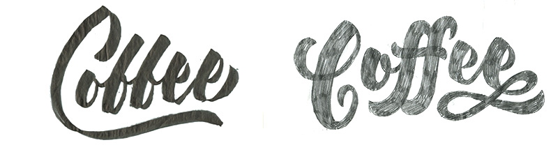
After refining both of these sketches, I decided to move forward with the sketch on the right, because I thought the letter "f"s were more legible, and I liked how the descenders hug the letter "o".

To further refine this sketch, I simplified it by removing the flourish below the letter "e", and compensated for that empty space by replacing the capital letter "C" with the letter "C" from my previously abandoned sketch. This new "C" filled that empty space below the letter "e"s, and fit nicely tucked in to the space above the letter "o". This new letter "C" was also accommodating for the descenders of the letter "f"s.


3. Plan your composition - Consider the context for your project / design a composition around the lettering.

Now, with the lettering refined, I started to consider how I wanted to craft the composition around my lettering. I referred back to one of my initial sketches, and decided to house the lettering in an oval shape, and to create ornamentation within the oval by dividing the space around the word evenly within the shape. To draw a perfect oval by hand is a difficult task, so I opened up Adobe Illustrator to create a perfect oval the size I needed for my lettering. I then printed the oval, traced it around my lettering, and then began to divide the space. After I thought the spacing was looking good enough, I broke out the Pentel Color Brush, and traced over the graphite to add contrast and weight to the lines.

Next, I decided to add to the composition outside of the oval, so I could incorporate coffee mugs into the composition. I quickly sketched out a kind of gestural representation of what I was going for. Now, similar to the way I refined the lettering from a thumbnail, I transferred the oval design to a large sheet of paper in order to work out the details of the new addition to the composition.

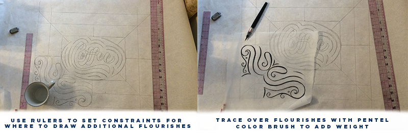
Above, you will see I added 4" on every side of the oval and divided it both horizontally and vertically. I then approached drawing the additional flourishes as a unit that would eventually be reflected to create a symmetrical boarder around the oval.


4. Adhere drawing to table - Make sure drawing is secured in place so it does not move later on. 

Now, with the additional flourishes reflected around the oval, I secured the final drawing to a coffee table to make sure it wouldn't move while I was working with the coffee.


5. Work with your 3d materials! - Get a feel for the material you are working with by experimenting. If you are working with a spice or something like coffee grounds, I recommend using a small butter knife to direct the material. Below are a few tips for working with a material like coffee grounds. 

How to create thin lines with a material similar to coffee grounds

How to create thin lines with a material similar to coffee grounds

How to fill in bold letters with a material similar to coffee grounds

How to fill in bold letters with a material similar to coffee grounds

Here is a more detailed video about Using a brush to clean up excess material

Here is a more detailed video about Using a brush to clean up excess material


Once again, Here is the final piece! I realize that I didn't go into detail about photography and image editing. This is partially because this article is already pretty long, and I plan on sharing some photo editing tips in a future post.


Well, I hope that you got something out of this! This is my first time ever creating a newsletter, and I want to make each post interesting and worth while! If you have anything you would like for me to write about , I would love to hear about it! Please reach me through email at raymawst@gmail.com

Also, if there is anything you think I can improve about the way I set up this newsletter, don't hesitate to reach out and let me know. I want to know so I can make it better for you guys! Thanks for taking the time to read!

Tags lettering, handlettering, custom lettering, custom, custom type, typography, illustration, editorial, Ray Mawst, Ray Mawst Lettering & Design, Design, Art, Coffee, 3d
Comment
Header_8_favorite.jpg

8 of my Favorite Lettering Tools

January 29, 2016

First of all, I want to thank you for subscribing to my Lettering and Design newsletter! My aim with this weekly newsletter is to push myself to further develop my voice and to share knowledge more openly. I hope to shine a light on some of the things I have learned over the years working as a professional designer and lettering artist, and I hope to inspire thought and conversations around lettering and design. Thanks again for joining me in this journey!


Before I jump into showing you my 8 favorite lettering tools, I would like to quickly introduce myself! My name is Ray Mawst, and I am a graphic artist currently living in Sun Prairie, Wisconsin. In short, I graduated with a BFA in design, moved out to New York City to work as a designer in a branding company for 2 years, and now have moved back home to Wisconsin to focus on building my freelance career as a lettering artist.

So with that said, let’s talk about some lettering tools!

1. Pentel GraphGear 1000 - .7 lead -

PENCIL.jpg

This is my favorite pencil ever, and here’s why. It never needs to be sharpened, and when working through a lot of sketches, I find this to be a time saver. Also, notice that the tip has a thin metal lead stabilizer. This prevents the lead from breaking as easily as a conventional mechanical pencil.

For a while I used the Staedtler Mars 780 Technical Mechanical Pencil which I know a lot of lettering artists swear by, but I wasn’t a big fan. What turned me off was how quickly the lead flattened out and how often it needed to be sharpened. Look at how blunt that tool is! After a few minutes of use, that is what it dwindles down to. Too thick to work with.

The only downside of the GraphGear 1000 is its puny eraser. So I recommend having an extra eraser off to the side if you plan on erasing up a storm. Get it here
 

2. Pentel Color Brush Pen

As far as brush pens go, this is my favorite at the moment. With very light pressure, you can write super thin lines, and with more pressure you can get a mark with a substantial width. If you have ever used a Tombow brush pen, the way this pen writes is a bit different. As opposed to the Tombow and its felt tip, the Color Brush has a nylon brush tip. This is favorable in my opinion because the nylon doesn’t wear out like the felt tip of the Tombow. It takes some practice to become more precise with the mark making, but in the end I think you gain greater control with contrast between the thicks and thins.

The base of this pen is not made for easy refill, so I recommend you just buy the refill cartridges sold separately. Get the brush here
 

 3. Pentel Japan Aquash Waterbrush Water Brush Pen, Medium

This pen is unique because it is sold as an empty vessel for you to fill with your own ink. The brush tip is nylon, just like the Color Brush. Try filling it with some Dr. Ph. Martin’s Radiant Concentrated Water Color ink. They have a great selection of colors, and like the name implies, the colors are radiant and beautiful. The less diluted the concentrate, the more saturated the color will be. Get the pen here and Get the ink here


4. Pilot Parallel Pen - 6mm Nib

What’s beautiful about this calligraphy pen is that it has a refillable cartridge on the inside. This is nice, I think especially while you are learning because you won’t have to worry about dipping the pen in the right amount of ink. What is also cool is, you can still dip the tip in different colored inks to get a unique effect. In this photo, I have black ink within the pen, and dipped the tip in the blue watercolor ink at the beginning of each letter. TIP: You can buy the refill cartridges sold separately, or you can buy your own vile of ink with dropper, and refill the cartridge. Get the pen here
 

5. Marvy DecoColor Metallic Gold Paint Marker 2mm

Behold the gold! I have purchased quite a few gold markers, and honestly most have disappointed me with their lack of vibrance and reflectiveness, but not this one! If you shine a light on what you have written with this pen, you will see beautiful and natural transitions in the tone of the gold. Get the pen here


6. Bienfang 50-Yard by 12-Inch wide Sketching and Tracing Paper Roll

As opposed to buying pre-cut sheets of tracing paper, I prefer to buy a large roll like this. It’s nice to be able to tear off how ever much tracing paper you need for any given project. In the video above, I rip off just a small piece to draw over the letter "a", and don't have to feel bad about ruining a full size sheet. Another example is if you are working at a large scale, a letter size sheet isn’t going to cut it! With the roll, the height is determined by the size you purchase, but the width can be how ever long you need it to be. Get the paper here

7. Huion Ultra Thin Light Table

A light table is a little bit of an investment, but it’s worth it! The main reason to use one is for the contrast the bright light provides as it shines through the paper and line-work. If I am working on iterations of a piece of lettering or illustration, I make adjustments on a separate piece of paper placed on top of the previous version. The improved contrast from the light box makes it much easier to see through both pieces of paper, and allows me to make better calls about how to draw the next line. The photo of the letter "A" demonstrates the detail you get through the tracing paper. It makes the paper even more transparent than it already is. Get the light box here


8. C-Thru 24" English/Metric

Last but not least, is a clear ruler. If you don’t have a clear ruler, you need one! It is a game changer to have increments running down both the length and width. In this way, it is easier to draw lines with custom spacing. Notice in the video above, the clear ruler allows me to use its guidelines to straighten out the ruler in relationship to the baseline in order for me to draw the cap height parallel. Get yourself a double wide ruler here  I also recommend a smaller 12" ruler for when you are working on smaller letters. Get the short one here 


Well, I hope that you got something out of this! This is my first time ever creating a newsletter, and I want to make each post interesting and worth while! If you have anything you would like for me to write about , I would love to hear about it! 

Also, if there is anything you think I can improve about the way I set up this newsletter, don't hesitate to reach out and let me know. I want to know so I can make it better for you guys! Thanks for taking the time to read this all!


Tags Lettering, handlettering, design, Ray Mawst Lettering & Design, Art, Ray Mawst, Tools, Lettering Tools
2 Comments

Latest Posts

Featured
Jun 23, 2017
Jun 23, 2017
Jun 23, 2017
Jun 23, 2017
Gold Leaf Techniques On Glass & How To Start
Jun 23, 2017
Jun 23, 2017
Feb 9, 2017
Bracketing
Feb 9, 2017
Feb 9, 2017
Dec 30, 2016
Condensed Lettering
Dec 30, 2016
Dec 30, 2016
Dec 30, 2016
Mixing & Matching Letter Styles
Dec 30, 2016
Dec 30, 2016
Dec 30, 2016
Dot Grid Method
Dec 30, 2016
Dec 30, 2016
Nov 4, 2016
Tips For Creating Spontaneous Lettering
Nov 4, 2016
Nov 4, 2016
Sep 19, 2016
Tips For Understanding Flourishing
Sep 19, 2016
Sep 19, 2016
Sep 15, 2016
8 Books: My favorite and Most Useful Books
Sep 15, 2016
Sep 15, 2016
Aug 19, 2016
How To: Latin Letters
Aug 19, 2016
Aug 19, 2016
Duality_Mural_vines_Lettering.jpg

Murals & Paintings

Hand Painted Work

BlueWater_BG_monogram.jpg

Logotypes

& Monograms

Client and Personal

Lettering_Compilation_053117.jpg

Lettering & Design

Client and Personal


CASE STUDIES:

Flatbush Fest
Wiloha
Stuffed Pierogi Truck
Ready 366 Mural
Lake Effect
Comcast / Xfinity Lettering
Coffee